Well, I've had some trouble designing my blog-as you can see-but I decided that I couldn't let that hold me back any longer, so yesterday I started a card. Taylor Van Bruggen's blog,
Taylored Expressions, hosts a Sketch Challenge one time a month. This months sketch
here is an interesting sketch, and since this is the month of Halloween I decided to do a Halloween themed card for the challenge. I will enter a total of four cards for this challenge, rotating the sketch each time 'till I have made a card in every possible way. The prize is worth more if you use Taylor's stamps, soooooo I used this little Halloween stamp set
Frightful Night to make a card that was spooky yet cute.
 |
| The crackle effect makes it look old, the stickles make the windows look like there's a light behind them, and the ghost(whose main purpose is to be cute ^w^) signifies that this is a "haunted" house |
 |
| Smooch Spritz makes it sparkle |
 |
| The black Smooch looks like the sky and the combination of Smooch and Stickles give life to this Harvest Moon |
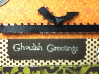 |
| Ribbon was formed in the shape of a "bat" |
This card was not one that made me want to pull my hair out from mistakes(I made little to no mistakes on this card); however, I put more detail into this one than I have in my previous cards. Orange, Green, and Black are traditional Halloween colors and all of the DP's I used came from a Halloween themed paper pack. I deviated from the sketch in two ways: on each of the two panels of paper I cut another strip to fit inside the first one and popped it up using 3D squares, and I placed the bigger circle more to the right.
Dimension was was the central idea for this card. The two strips of paper, the clouds, the big circle, and the tree are all on 3D squares; the moon, the star, the windows, and the chimney is Stickled; the black part of the house was covered in Crackle accents by Ranger in order to give it that "haunted house" look; the small circle, the moon, the star, and the entire house and door was colored with Smooch from the tube and the tree was sprayed with Smooch from the bottle. The reason I used Smooch instead of Copics was to give it that slight sparkle and shine. Instead I used Copics to outline the clouds in light gray and for the grass.
Stamps: Taylored Expressions Frightful Night stamp set
Ink: Memento Tuxedo, StazOn Metallic Silver
Paper: the Paper Studio Jeepers Creepers pack
Dies: Spellbinders Standard Circles, Curved Rectangles
Stickles: Star Dust, Diamond, Black Diamond
Smooch: Tuxedo, Olive Twist, Sundance, and Smooch Spritz in white
This was an interesting sketch and I had a lot of fun making this card!
~Sara


